This is the home of the creative work of Paul Butler.
I create pen plots, explorable explanations, and code notebooks (among other things).
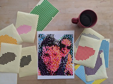
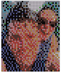
Office Supply Pointillism
March 2019
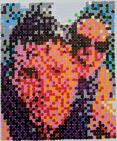
An attempt at creating a photorealistic reproduction of an image using 1,500 colored dot stickers.
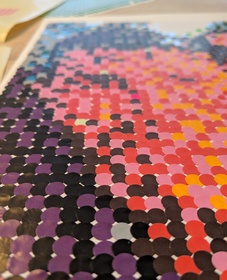
I used Floyd– Steinberg dithering to determine the dot placement and then placed the stickers by hand.


Did The White House Alter a Video?
December 2018

A code notebook that takes a mathematical approach to forensic video analysis.

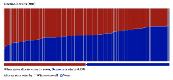
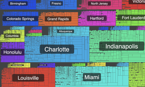
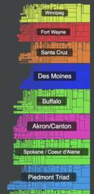
November 2018

A data portal that uses interactive visualizations to explain ranked choice election results.

The Misunderstood Electoral College
November 2018

An explorable explanation of some unintuitive implications of the electoral college.

Understanding the Mandelbrot Fractal
August 2018

A tour of complex arithmatic, leading to the construction of the Mandelbrot fractal.

Optimizing Plots with a TSP Solver
March 2018


A runnable notebook that explains how to model plotter path optimization as a routing optimization problem.


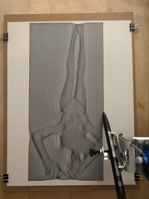
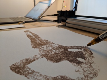
Sketch Experiments
January 2018

A series of plots exploring ways to generate sketches from a photograph, including a Metropolis–Hastings random walk.

December 2017


A series of plots using a technique I call surface projection, and a code notebook that explains it.


Fractal Generation with L-Systems
July 2017

A series of plots generated by Lindenmayer Systems, and a notebook explaining the technique.

December 2016
A browser extension for visualizing the tree structure of Twitter conversations.
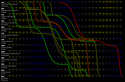
January 2013
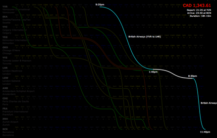
Exploration of an alternative UI for presenting international flight options.
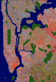
December 2012
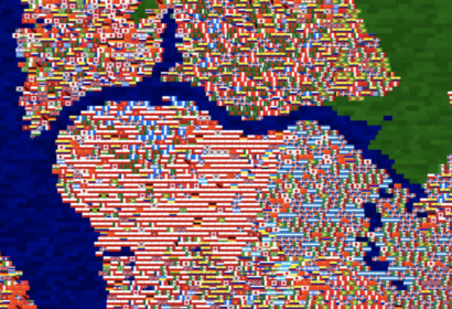
A map of New York City made from 60,000 flags, drawn proportionately from the birthplaces of the foreign-born inhabitants of each census tract.
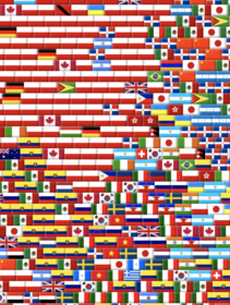
Created for an art exhibition in Cleveland, Ohio.
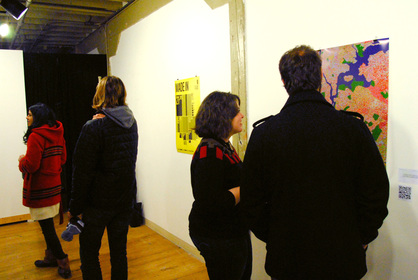
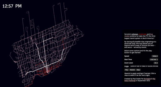
September 2012
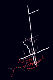
Interactive visualization of point-to-point transit times on Toronto’s TTC transit network.
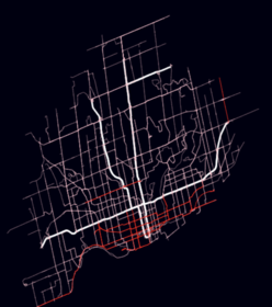
Winner of the Kontagent Big Data Challenge ($10K prize.)
February 2011
Interactive visualization of Groupon deals collected from the web in 2011, shortly before their IPO.
Featured in the July-August 2011 Harvard Business Review


February 2011
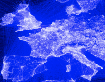
Visualization of ten million Facebook friend pairs. Featured on the Facebook Engineering blog as well as The Economist, BBC, and Time.
